
From Code to Clarity:
Solving a Communication Challenge for Software Engineers

This scenario-based eLearning experience was designed for mid-level software engineers at Byte & Bite, a fictitious restaurant rating startup. The learning experience challenges engineers to communicate with clarity, both proactively and under pressure. Learners step into the role of a developer navigating vague feature tickets and blockers that impact delivery.
Instead of relying on passive instruction, the experience uses branching scenarios with real consequences to strengthen communication skills that support alignment and reduce rework. Each challenge mirrors real-world dynamics from agile workflows and sprint planning rituals, giving engineers a safe space to practice and apply strategies they can use right away.
Target Audience: Mid-Level Software Engineers working in agile environments
Role: Instructional Design, Scenario Writing, Visual Design, eLearning Development
Tools: Articulate Storyline 360, Figma, Adobe Suite, Miro, Google Docs, Amazon S3 (AWS Hosting)
The Problem
At Byte & Bite, miscommunication between engineers and product managers was slowing down sprints and causing rework. Engineers often stayed quiet on vague tickets, waited too long to raise blockers, or shared them without enough context. When issues were flagged late by product managers, responses sometimes came across as defensive instead of collaborative. As a consequence, this chipped away at trust and made it harder to keep projects on track.
The Solution
A two-part, scenario-based module series that zeroed in on these pain points:
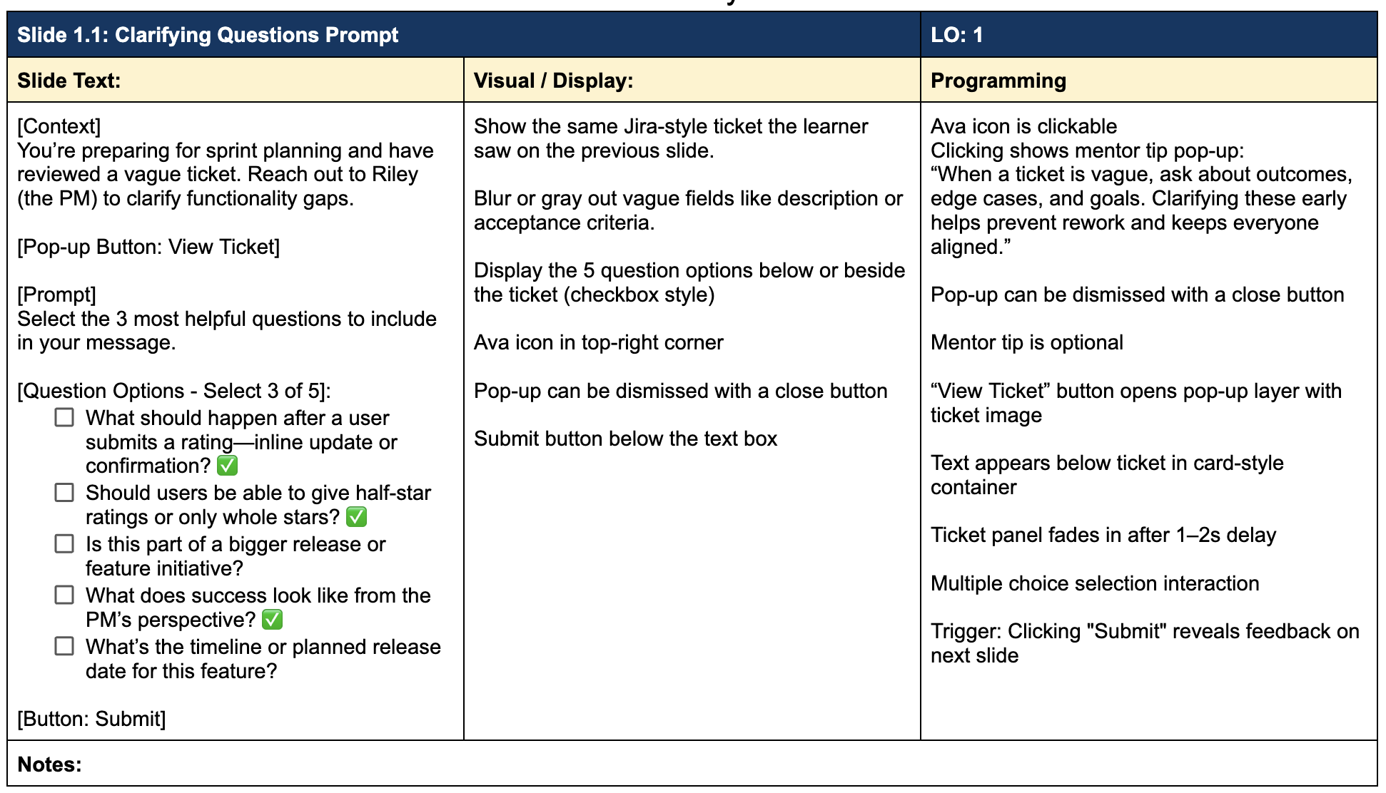
The first module helps engineers practice asking clarifying questions early so vague tickets do not lead to misalignment later.
The second module helps engineers practice raising blockers clearly and responding constructively when product managers flag issues under pressure.
The scenarios mirror real sprint dynamics, so engineers make decisions, experience the consequences, and walk away with practical strategies to reduce rework, build trust, and keep sprints on track.
My Process
This project followed the ADDIE model from start to finish.
Partnering with a subject matter expert, I validated technical details, explored realistic scenarios, and aligned the training with industry best practices. I also interviewed someone in the target audience to uncover real-world challenges and design scenarios that felt authentic and relevant to learners.
These insights shaped the learning objectives, content, and visuals. Below are the steps I took to bring the training to life.
Action Map
I used Cathy Moore’s Action Mapping framework to align with the SME on the project vision, business goal, and key behaviors engineers need to perform on the job. This early step was essential for getting clear on expectations and ensuring every piece of content and each interaction stayed focused on real-world application.
By identifying actions first, I avoided content overload and kept the training centered on decisions that have a real impact on communication-related rework.

Text-Based Storyboard
Building on the priorities established through action mapping, I used a text-based storyboard to map out dialogue, decision points, consequences, and feedback across each scenario.
This format made it easy to visualize branching paths, keep the narrative tight, and focus on learner experience before moving into visual design. It also allowed for quick iteration and feedback from my SME, helping to fine-tune tone, pacing, and outcomes early on before development in Storyline began.

Visual Design
Once the storyboard was approved, I shifted into visual design to create an intuitive, polished experience for learners. I began by creating a mood board and visual style guide to establish the look, feel, and standards before development.
Mood Board
I sourced assets from Freepik to define the look and feel of the training by selecting diverse, modern characters and realistic workplace settings (office, desktop, virtual meetings) to reflect the day-to-day context of mid-level engineers.
Style Guide
I established clear standards for color, typography, button states, and spacing.
Colors reinforce hierarchy and usability (clear hover states, accessible contrasts)
Typography (Poppins & Open Sans) supports readability across screen sizes
Spacing guides streamline layout decisions and improve visual clarity

Mood Board

Style Guide
Visual Mockups
With the look and feel locked in, I used Figma to put together low-fidelity wireframes and an interactive prototype to map out layout, test the flow, and make sure everything felt intuitive before building in Storyline.
Low-Fidelity Mockups
These early layouts helped me plan content placement, test how each slide would flow, and make sure the structure supported both the learning objectives and the learner’s experience. Wireframing made it easy to tweak things based on SME feedback before moving into more detailed visual design.

High-Fidelity Mockups
After the layout and flow were approved, I created high-fidelity mockups in Figma to finalize the visual details. This step helped elevate the overall design, ensure key screens supported behavior-change moments, and gave me a clear blueprint to follow during Storyline development.

Interactive Prototype
I built an interactive prototype in Figma that simulated key parts of the learner journey, such as decision making moments, feedback screens, and reflection prompts. Sharing this with my SME provided a realistic preview and allowed us to align on functionality, flow, and learner experience before full development.
Here’s a short preview highlighting how I tested navigation and interactivity before moving into full development.
Full Development with Articulate Storyline 360
With the visual and instructional design finalized, I built the full training in Articulate Storyline 360. I used layers, triggers, and variables to create branching scenarios that responded to learner choices in real time. The visual system I established earlier made development more efficient and ensured consistency across slides.

